
Report: The Magnificent Seven
As the biggest-ever platform shift in modern technology unfolds, together with D...
Cohort analysis allows you to "examine the behaviour and performance of groups of users related by common attributes."
Here's a description which you might be familiar with if you're a power user of Google Analytics. Sounds scary, right? We don't blame you!
Hope this hasn't put you off. Taking a few moments to understand this concept is key to operating a successful online business, especially if you're looking to ramp up your marketing budget.
Put simply, it's all about analysing your customers by dividing them into sub-groups based on a common characteristic. This can be as granular as you want being based on gender, geography, device type and more - but most often 'Acquisition Date' is a natural starting point.
The idea here is to dive deeper into your KPIs to assess whether there are any notable trends in the way that newer customers behave versus early adopters.
Many performance indicators can be analysed from a cohort perspective such as monthly usage, payer penetration and order value to give a few examples.
As a powerful tool for the digital entrepreneur, it allows us to examine how customer behaviour evolves in multiple dimensions:
Retention trends will of course depend on the metric being analysed as well as the industry. An online seller of used cars will clearly observe very different trends compared to a trendy new dating app, but across verticals it's common to see the sharpest declines in the first few months of customer activity.
For illustrative purposes, let's take the example of a representative food delivery app called DeliverMyFoodNow - a savvy name for a new venture which prioritises super-fast restaurant deliveries over food quality. 😋
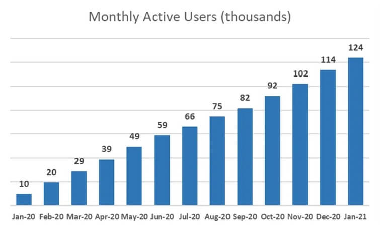
Since their beta launch in January last year, followed by a boom in food delivery demand during 2020, the app has skyrocketed in popularity to now reach 120k monthly users. Amazing figures on the surface to say the least!
But we want to do our due-diligence… is this worthy of our VC dollars?
After speaking to management, we want to assess whether the higher delivery fees (which apply after the enticing free-trial month!) introduced in March 2020 are having a significant impact on customer retention.
And here's what they sent us after our data request for active users by cohort:
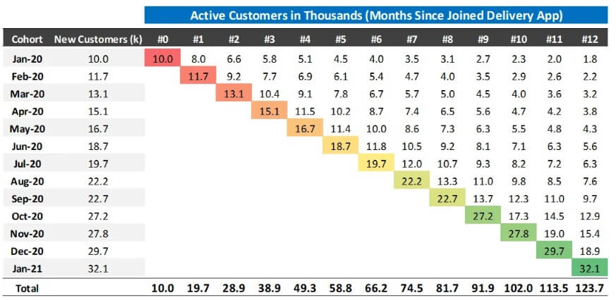
Before examining the cohort data, we've been informed that the company defines a customer as active if they place at least one order in that month.
So lots more numbers for us to analyse, great! But where do we start?
Cohort data becomes a lot more meaningful when we start to look at the underlying retention ratios. Let's flip the triangle to look at the data on a relative basis (since month of first order) and calculate the retention percentages to examine how the usage behaviour has evolved.
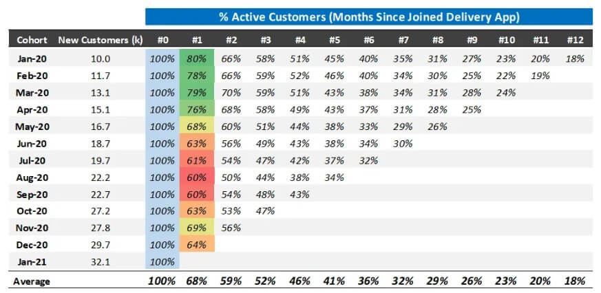
Some initial observations after seeing this transformed data:
But most importantly it might be a good idea for them to reverse that delivery fee hike to bump up those MAU figures ahead of their Series A road show…
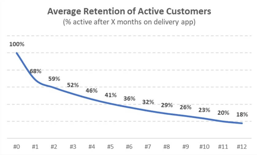
Note how this conclusion is impossible to draw by just analysing the data on an aggregate basis. The average retention trends paint a rosy picture with ~70% of customers returning in their second month with~20% as a long-tail.
Average retention can play an important part for revenue forecasting in many segments across digital, especially since it can be fine-tuned over time as further data points become naturally available.
And as part of a revenue modelling logic it enables us to bridge customer acquisition to the all important MAU metrics.
Often we see plenty of confusion in how to truly calculate customer lifetime value and we could write a whole article on this topic alone (and we will).
Where cohort analysis starts to become even more useful is to accurately calculate customer lifetime.
The most common formula which is often used might be something of the form: Monthly Average Gross Profit / Monthly Churn Rate.
While this is okay as an initial approximation, one of the inherent assumptions is that the monthly churn rate is constant across the customer lifetime - which is far from typical aggregate customer behaviour.
That's a wrap up - stay tuned for our follow-up post which will cover all the details behind calculating an LTV estimate with precision by using the full retention curve!
As the biggest-ever platform shift in modern technology unfolds, together with D...
We are formally launching our tech sector coverage in Latin America, an ever-evo...

In conversation with Francisco Loehnert, co-founder and CEO of Awto, an autotech...

In conversation with Gabriela Estrada, co-founder and CEO of Vexi, a neobanking ...

2023 has been a wild ride in tech. From the rise of gen AI to public valuation m...

We checked in on the data and trends driving the global startup, tech and ventur...

We partnered with Dealroom to deliver the latest update on European tech ecosyst...

With the proliferation of new technologies comes the growing number and complexi...
Beyond understanding the corporate finance principles behind company valuation m...

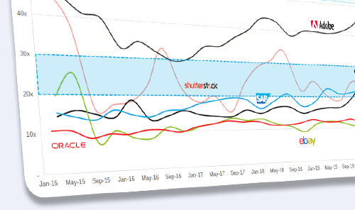
Software as a Service (SaaS) business model has been around for a while, growing...

ARPPU, or 'Average Revenue per Paying User', is a measurement of the predicted r...
While most management teams tend to be overly optimistic when putting together f...
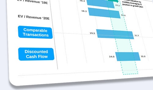
Company valuation is a key aspect of corporate finance that is used to determine...

South Korea is the fastest growing Asian Tiger nation for VC investment, and Seo...

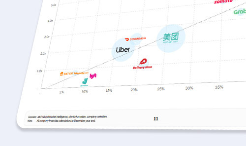
Deliveroo is reported to target a $10B valuation in an upcoming IPO. In preparat...

In this report, we take a deep dive into the creator economy ecosystem to analyz...

Climate change is one of the most threatening crises of our time and the world n...

This was a pretty crazy year, to say at least. The COVID-19 health crisis, while...